The music magazine pieces that I have designed and created are innovative, different and stand out from the crowed. When I designed and created the three pieces, I decided to follow a lot of the codes and conventions which my music genre uses, I looked at a couple of existing music magazine with the same genre as mine and followed similar codes and conventions. Even though I challenged minor conventions and put my own twist on my layout, images and sell lines which I thought worked very well with what I was trying to achieve. However these were minor challenges and I mainly stuck to the codes and conventions to reframe from making a magazine which didn’t appeal to my target audience. Examples of me following these conventions are shown mainly within my front cover. For example I looked at different hip hop front covers and found that the sell lines featured on the front covers were short and sweet, as well as being placed down the right side of the page. So by doing this you will see I featured one main sell line which draws the reader’s attention in and it was slightly tilted to follow the curve of the artist hand that made it look unique and different and made it stand out. And then I give them a tiny taster of what’s inside to make them really want to explore within the magazine.
The second convention that I followed was, the way in which hip hop magazine front covers always include an image of a male artist looking confident and powerful; this is done by having the artist pull angry expressions whilst wearing lots of expensive clothing.I followed this convention by having my artist/model pull a strong confident pose/expression whilst wear a new era hat, silver chain, G shock watch and a Ralph Lauren t-shirt. I did that to capture the essence of the artist and to show the target audience how the artist is.
Whilst creating my magazine I had to also think about what I was going to include within it; I had to research and find out what my target audience wanted to see, and a great way of doing this was by looking at music magazines that are aimed at my type of target audience and look at what is featured within each issue regularly. After doing this one type of feature that seemed to be very popular and inspired me was, the way the artist’s clothing seem to match everything on the front cover; this is when the artist would wear the same colours as the colours in that feature.
Here are some Hip Hop and RnB music magazine from which I got my inspiration from:


Here are the three pieces I created:


When designing my magazine, I had to produce a questionnaire that was aimed at young adults who enjoyed hip hop, who were smart down to earth people, as these were the type of artists and people that my magazine included and were about it felt the I had to represent my target audience as well as the artist in a certain way. This is a company that aims there music at the same type of people that fulfil my target audience profile. My target audience are people from the ages 15-25, and even older. Who are determined and seek out people in life who are like them and enjoy hip hop and people who are passionate about music no matter the genre. They are people who have acquired good skills and qualifications in areas that interest them and want to pursue. These are people who look for inspiration and enjoy working hard and towards a goal. They have strong personalities and enjoy expensive clothes whilst not having a massive care for how they look. And of course they love hip hop and all its different styles, though really love and enjoy certain and specific types of hip hop and artists.
And my magazine is suitable for this target audience as it gives information on hip hop as a whole, then it talks about and features the specific type of hip hop which includes a large variety of hip hop artists that my target audience love; it then includes information that my target audience would find interesting. This is all done through brilliant artists featured, reviews and brilliant interviews with personal inspiring information which give an insight into artist who relate greatly to my target audience. Lastly I believe it’s suitable because the language used, is common English and slang words which make the reader feel like he is the artist and part of the scene because he can understand what is being said, where others wouldn’t have a clue and which makes the reader feel special; this is a form of direct address.
Post Production
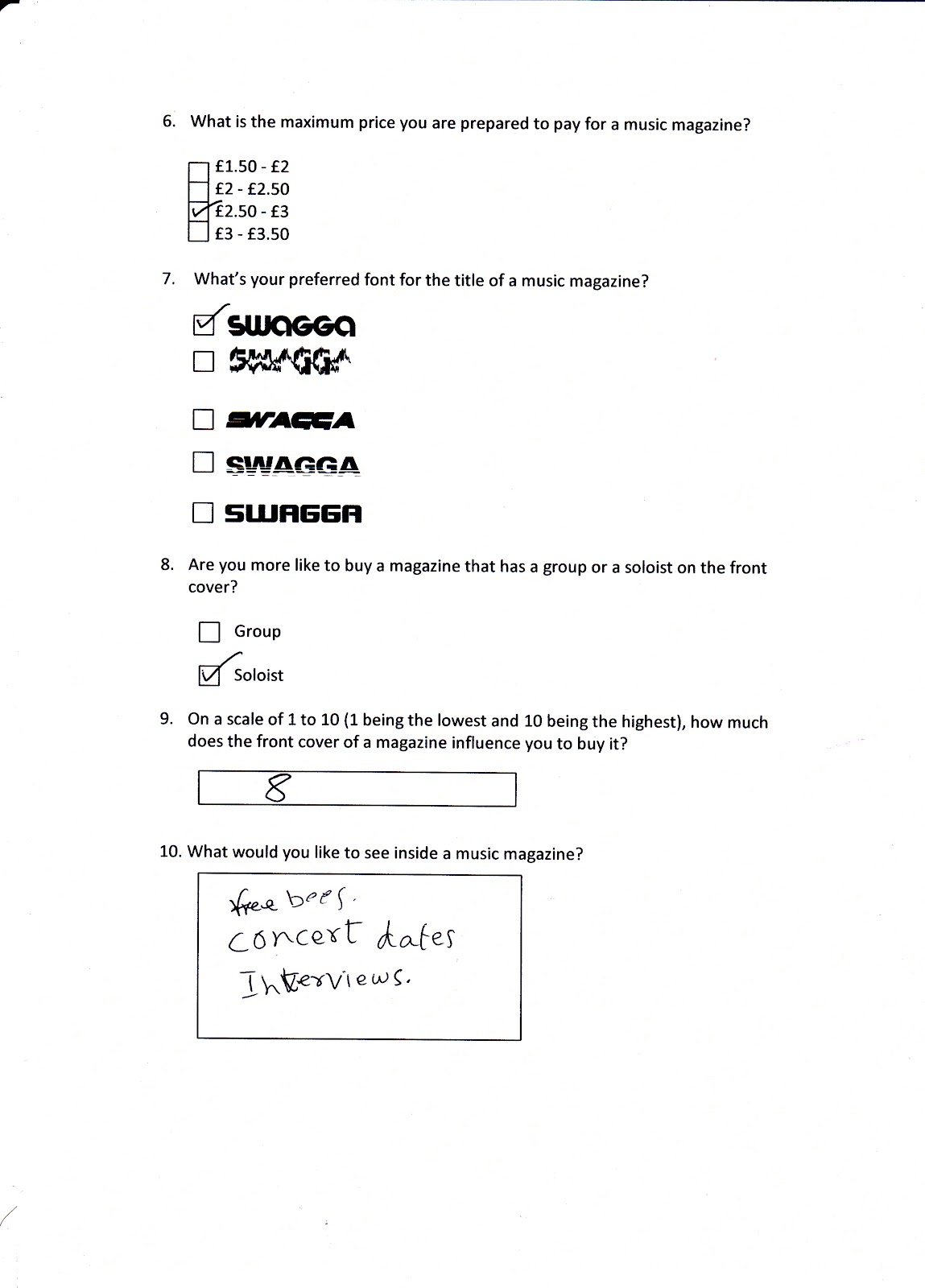
For my Post Production research. I used the internet social network website Facebook as it is a main internet website the target audience of my magazine would visit. I had people answer a questionnaire about my front cover, contents page and double page spread this was very successful and gave me great feedback on what I could improve, I found that I need to change some colours so that the reader could view it better and I need to make my puff a bit smaller because it was cover the picture a little too much. Other than these minor changes, all feedback came back positive; here is an example of a networking site I went on, the questionnaire I used and my target audience.


Here are the three products after I had made the changes from my feedback:


The three media pieces that I created represent hip hop and RnB in every way. As everything which is in the magazine is hip hop. As the topics which features in my magazine include everything that’s going on in the hip hop world.